Orange Juice
Your
quarterly
vitamin.
Alter Your Thinking
Written on 04/4/16 5:00 PM
RPM Creative Director Bob McCartney talks about Alter Brewing Company
by Bart Darress
Back in 1993, Mark Hedrick dabbled with his first batches of home-brewed beer made on a stove in his north side Chicago apartment. With plastic bucket fermenters and old bottles he cleaned out in his bathtub, Mark perfected his own take on various beer styles and flavors.
Fast forward to 2013, in the quaint suburb of Downers Grove, IL, two Chicago day-traders approach Mark with an idea. And after years of research and formal brewing education at Chicago’s Siebel Institute of Technology, the Alter Brewing Company was born.
More than a year later, Alter has found sure footing in the increasingly crowded craft beer industry. Competition is particularly intense here in Illinois with over 145 breweries in the Chicago area alone. Enter RPM Advertising. Bob McCarthy talks to us about marketing in one of the country’s hottest product categories.
OJ: Tell us how the Alter assignment came about?
McCARTNEY: Basically, Mark Hedrick was having these beer-tasting parties at his house in the suburbs – I think he called it the Shed Club. He invited friends and friends of friends who really loved beer. They all hung out in Mark’s backyard, tasting the different beers he’d made. One of the partners here at RPM was at one of these Shed Club parties.
OJ: The craft beer community is important to the Alter founders?
McCARTNEY: Definitely. It’s a real close-knit community. They share secrets and help each other out. It’s not fierce competition. It’s shared admiration for each other’s talent and success. They all just love beer. And they love talking about it, and of course, drinking it.
OJ: So over a few beers Mark hits it off with one of the partners and comes to RPM?
McCARTNEY: We all met at the RPM office, it was real laid-back. They simply said, “Make us a logo and some business cards. We want a brand.”
OJ: What were some of the issues facing Alter? Obviously, this was a lot easier said than done.
McCARTNEY: Absolutely. Craft brewing has literally exploded in the U.S. over the past decade. It’s easy to get started. The internet has given anyone who wants it a blueprint for brewing beer. Add more sophistication on behalf of the beer drinkers’ palate and the rise of entrepreneurship and home-grown business due to the economy, and you’ve got a crowded market all trying to get attention.
OJ: Who are some of the competitors in the Chicago craft beer market?
McCARTNEY: Well, the big players are Three Floyds, Revolution and Dark Horse. And older brew companies like Goose Island and Two Brothers. They’ve all done a fantastic job of grassroots marketing and exploiting the underdog, outside-of-the-mainstream position. Each has a distinct mantra, memorable look and personality.
- Ready To Ship!
- Beer & BBQ
- Alter Pride
- Picture Perfect Summer
OJ: So how do they compete? What did your team do to help Alter stand out?
McCARTNEY: The Alter guys are really smart – they came to us with a pretty filled in vision for what they wanted. I mean, these guys are connoisseurs, beer junkies, beer-o-philes. But they really didn’t know what to do about the marketing.
At this time, the business hadn’t started, the taproom wasn’t going yet. And there wasn’t a lot of money. So we began with the name – it’s a really cool name! We wanted to do the kind of logo that would instantly brand the company and really set them apart.
OJ: How does a logo do all that in an intense segment like craft beer?
McCARTNEY: Think about it: The logo’s everything. It’s on the tap handle at the bar. It’s on the label. It’s going to be on the bottles eventually. And with craft beer, it’s all the consumer has to go on usually when he’s choosing what to drink. At the bar, at the store…
OJ: You said “he.” Who is the craft beer consumer in your mind?
McCARTNEY: Craft beer really took off with the rise of millennials. This group wants authenticity. They want edgy and real. It leans towards young men but honestly, craft beer enthusiasts can come in almost any age group, any race, men or women, rich or poor. It has more to do with a state-of-mind or passion for fine craftsmanship.
OJ: So you have a name. Where do you go from there?
McCARTNEY: Every designer in the place wanted to take a stab at this assignment. But first we got together and really thought about the competition, we talked out what the name meant, what kind of attributes we thought were important when designing… I mean, the whole brand had to come through this logo; it had to carry all the weight. It had to be a huge idea.
We went through literally hundreds of designs and showed about 20 to the Alter guys. They all landed on one in particular, almost immediately. And it wasn’t just about the logo, we presented our thoughts on what the name could mean.
OJ: So what was the big idea?
McCARTNEY: Alter your thinking, see things differently, there’s always more than one way of doing things, looking at things.
OJ: Which really plays into the logo you went with. Tell us about it.
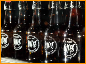
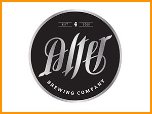
McCARTNEY: It’s an ambigram – meaning, you can read it right-side up and upside down. It was honestly the very first thing that popped into my head when we were creating. The word Alter works perfectly as an ambigram. And when people find it, they’re blown away. We made stickers, coasters, lots of stuff and drinkers can’t get enough of it.
Word-of-mouth is probably the most powerful thing in the craft beer market. Have you tried such-and-such? Oh man, you got to try it! So the name, the logo became a calling card, an invitation to try the beer. And we knew that’s all it would take. The product is incredible. We just needed to get people saying and thinking the word, Alter.
OJ: Looking at the design, it’s very clean and simple. Why black & white?
McCARTNEY: The word Alter is always the focus. When designing, our buzzword was “simplicity.” We didn’t want to be trendy or wacky like some of the other brands. When we went to Binny’s (a local liquor retailor) we looked around at all the craft beer logos and labels, and we noticed something: Everyone was trying so hard to be different, trying so hard to be loud, to stand out… that it all became the same. We decided that simplicity, being clean and clever, made us stand out among all the crazy colorful, animated brands.
Plus, we didn’t want to break the bank. We wanted the look to be affordable and easily replicated in the future. We wanted that same simple look of the logo on the business cards, on the coasters, on the trucks, and on and on.
OJ: How do you take the history, the simple look and budget and market Alter in such a competitive industry?
McCARTNEY: Social media is the Alter weapon of choice. It’s a way to literally talk to their customers every day if they want. The company sends out updates and event info on Twitter and Facebook and followers and friends come based on that. It’s just incredible really, the taproom is jam-packed every night.
The idea is to market the brand just like the original Shed Club – friends of friends of friends come and taste the beer and so on. It’s the whole vision come full-circle, so to speak.
What we’re doing is building the Legend of Alter as we’re going. For example, on the back of the label we’re putting a little drawing of a shed and the number “93” for when it all started. We’re creating mystique and intrigue. We’re trying to use old-school tools that don’t cost much, setting up cool little things now that we can trigger later on. We’re always “altering” the brand to keep it vital so it connects with more and more drinkers.
